Want to help customers buy your products faster? Ever landed on an online store, liked a product and then felt a little annoyed by the number of steps needed to buy it? It happens more often than store owners realize.
A shopper clicks a product. Adds it to cart. Opens the cart page. Reviews the cart again. Then finally reaches checkout. It sounds normal. But in reality, somewhere in that journey many customers quietly disappear.
Not because they didn’t want the product. Usually they did. The problem is the process just felt slow. Too many clicks. Too many pages. People today expect speed. Online shopping especially.
This is where WooCommerce Quick Buy features begin to change things. Instead of pushing customers through the full WooCommerce purchase process, a Quick Buy button lets them move directly toward checkout. One click. Maybe two. Purchase almost done.
Understanding the Role of WooCommerce Quick Buy Buttons
At first glance, the Quick Buy button looks like a simple feature. Just another button under a product. Nothing complicated. But the impact can be surprisingly big.
Normally the purchase flow looks like this. A customer sees a product. Clicks Add to Cart. Goes to the cart page. Reviews items. Then finally clicks checkout. It works, of course. WooCommerce has used this flow for years. But many customers don’t really want all those steps.
Sometimes they already know what they want. Maybe they saw the product in an ad earlier that day. Maybe a friend recommended it. Or maybe they already bought it before and are simply returning to buy again.
In moments like that, the normal cart process feels unnecessary. Even annoying. This is where WooCommerce Quick Buy buttons start making sense. They shorten the buying journey. Instead of wandering through pages, the shopper moves straight to checkout.
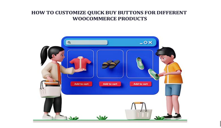
Ways to Customize Quick Buy Buttons for Different Products
Customization is where things become interesting. Because not every product should behave the same way. Some items are simple purchases. Others require a bit more attention.
Many store owners begin with global settings. Meaning every product gets the same Quick Buy behavior. That works as a starting point. But later they realize certain products need different treatment.
For example, imagine a store selling both phone chargers and expensive headphones. The charger? People often buy it instantly. The headphones? Customers might want to read details first.
So, the store owner adjusts things. Chargers use direct checkout. Headphones keep the normal cart flow.
Another decision is where the Quick Buy button appears. Some stores only place it on product pages. Others display it on shop pages or category listings as well.
Customizing Quick Buy Button Text
Changing the text on the Quick Buy button sounds like a tiny thing. Almost insignificant. But it can influence how customers react.
Most stores start with the classic label: Buy Now. Simple. Direct. Clear. But sometimes a different phrase fits better depending on the product.
Think about an online store selling eBooks. “Download Now” might feel more natural. A fashion store running a weekend sale could use “Get Yours Today.” A gadget shop might experiment with “Order Instantly.” Different words create slightly different emotions. Urgency. Curiosity. Excitement.
Setting Different Redirect Modes
Another important customization involves what happens after the customer clicks the Quick Buy button. This is called the redirect behavior.
Some stores send customers directly to the checkout page. This is the fastest option. One click and the checkout loads with the product already inside the order.
Other stores prefer sending users to the cart page first. It gives customers a moment to review their purchase. Maybe they decide to add another item before finishing the order.
Then there is the popup checkout method. Instead of navigating to another page, the checkout form appears in a small window. The shopper stays on the same page the whole time.
Each option creates a different feeling during the buying process. Some customers prefer speed. Others appreciate a quick review before paying. The best choice usually depends on the product type and the store’s overall strategy.
Customizing Quick Buy for Simple and Variable Products
WooCommerce products come in several types. And Quick Buy buttons must handle them properly.
Simple products are the easiest. They have no options. No variations. Just one product ready to purchase. In this case the Quick Buy button can immediately send the customer to checkout without any interruption.
Variable products are different. These include options like size, color, material, or style. Customers must choose one before completing the order. So, when someone clicks Quick Buy without selecting a variation, the system gently reminds them. A small message appears asking them to choose an option first.
It’s actually important. Without this step, customers might accidentally order the wrong version of the product. That leads to returns. Support tickets. Frustrated buyers. Instead the system pauses briefly. Waits for the correct selection. Then continues the checkout process.
Add Quick Buy Button to WooCommerce Products
At some point many store owners decide to Add Quick Buy Button to WooCommerce Products that sell frequently or encourage impulse purchases. These are usually best-selling items, flash sales, or limited-time offers.
Imagine a customer scrolling through a product category late at night. They notice a discounted item they’ve been thinking about buying for weeks. The price suddenly looks very attractive. They don’t want to overthink it.
Right beneath the product image there’s a Quick Buy button. One click. Checkout begins. No wandering through extra pages. No distractions from other products. The decision stays fresh in the shopper’s mind.
This approach works particularly well for promotional items and trusted products. Customers feel confident buying quickly. And store owners quietly notice that these buttons remove friction from the purchasing process.
Applying Quick Buy Buttons to Specific Product Categories
Another strategy involves enabling Quick Buy buttons only for certain product categories. Not everything needs instant checkout.
For example, a store might activate Quick Buy for accessories or low-priced products. These items rarely require long decision making. People buy them quickly anyway.
Meanwhile higher-priced items may keep the traditional Add to Cart button. Customers often want to read specifications, reviews, or comparisons before spending more money.
One electronics store experimented with this idea. Quick Buy buttons appeared on cables, adapters, and phone chargers. But laptops and monitors kept the normal purchase flow. The result felt balanced. Fast checkout for simple items. Slower, thoughtful purchasing for expensive ones.
Customizing Quick Buy for Different User Roles
WooCommerce stores sometimes serve very different types of customers. Retail buyers. Wholesale clients. Members. Guests. Each group behaves differently when shopping.
Wholesale buyers often know exactly what they want. They’ve probably purchased the same products many times before. For them, a Quick Buy button makes the process much faster.
Guest visitors may also appreciate quicker checkout because they don’t want to navigate multiple pages just to buy one product.
By adjusting Quick Buy behavior based on user roles, store owners create a more tailored shopping experience. It isn’t always perfect. But usually it works better than using the same checkout process for everyone. Flexibility matters in online stores.
Designing the Quick Buy Button for Better Visibility
Design plays a surprisingly big role here. If the Quick Buy button blends into the page too much, many shoppers simply overlook it. But when the button stands out slightly, clicks increase.
Some stores use bold colors. Bright orange. Green. Sometimes red. Others prefer softer colors that match the site’s branding. Both approaches can work.
Placement matters as well. Many stores place the Quick Buy button right below the product price. That’s where shoppers naturally look next.
Spacing, size, color contrast these small design choices quietly influence how customers behave on the page. You might not notice it immediately. But over time engagement improves.
Conclusion
Speed matters in modern online shopping. Customers expect things to happen quickly. When the checkout process feels slow or complicated, many shoppers simply leave the store before finishing their order.
Quick Buy buttons solve part of that problem by creating a shorter path between discovering a product and completing the purchase. The fewer steps customers must take, the easier it becomes for them to finish what they started.
By experimenting with button text, placement, redirect behavior, and product targeting, WooCommerce store owners gradually shape a checkout experience that feels natural for their customers.